Austin Childcare Connection
iOS Mobile App for Parents and Caregivers: Post jobs, match with caregivers, and find work.
Project Overview
Austin Childcare Connection connects nannies and parents, fostering learning, questions, and insights within the childcare industry. They offer a platform for parents to post jobs, find nannies, and access childcare resources.
Client: Austin Childcare Connection
Timeline: 3 weeks
Team: 3 UX Designers | Role: Design Lead
Building Trustworthy Childcare Connections
CHALLENGE
Our challenge was to design a platform that empowers users to make confident childcare decisions. We needed to create an inclusive experience that meets the diverse needs of all parents, including queer parents, fathers, and mothers. At the same time, our design had to consistently reflect Austin Childcare Connection's core values of trust, transparency, and education.
Develop an iOS mobile application that guides parents from exploring the company, signing up, and choosing a membership, to matching with potential caregivers.
SOLUTION


Just want to explore the final design? Click here to view hi-fi prototype
DISCOVER
Client did an initial research which included;
RESEARCH
Competitive and Comparative Analysis
Heuristic Evaluation
However, my team wanted to validate our findings with additional research to ensure we were heading in the right direction. The heuristic evaluation provided by the business was conducted on their website, which influenced part of the style guide. Ultimately, we agreed to design an iOS mobile app.
My team conducted the following research
Business Analysis
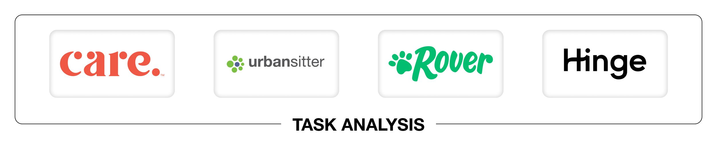
Task Analysis
User Research
Our comprehensive business analysis identified two key objectives:
BUSINESS ANALYSIS
Empower Users to Make Confident Decisions: Design a platform that provides clear, concise information and a user-friendly interface to help parents make informed childcare decisions.
Create an Inclusive Experience for Parents: Ensure the design caters to the diverse needs of all parents, including queer parents, fathers, and mothers, by incorporating features that reflect varying family structures and preferences.
Unveiling User Workflows
TASK ANALYSIS
To gain a comprehensive understanding of user workflows, we performed a task analysis on several comparator and competitor apps provided by the business.
Summary of Findings
From our task analysis of these apps, we identified several key insights:
Balancing Thoroughness and Convenience: While detailed onboarding and signup processes can lead to better matches, they can also overwhelm users. It's crucial to find the right balance to ensure a smooth user experience.
Personalization: Users highly value personalized experiences and recommendations. However, it's important to keep these features simple and not overcomplicate the user experience.
Simplicity in Matching: Users prefer straightforward and intuitive matching interfaces that quickly connect them with suitable caregivers.
User Engagement: Interactive and engaging elements in onboarding and signup processes can enhance the user experience, as long as they don't compromise essential information.
To gain a comprehensive understanding of the diverse needs
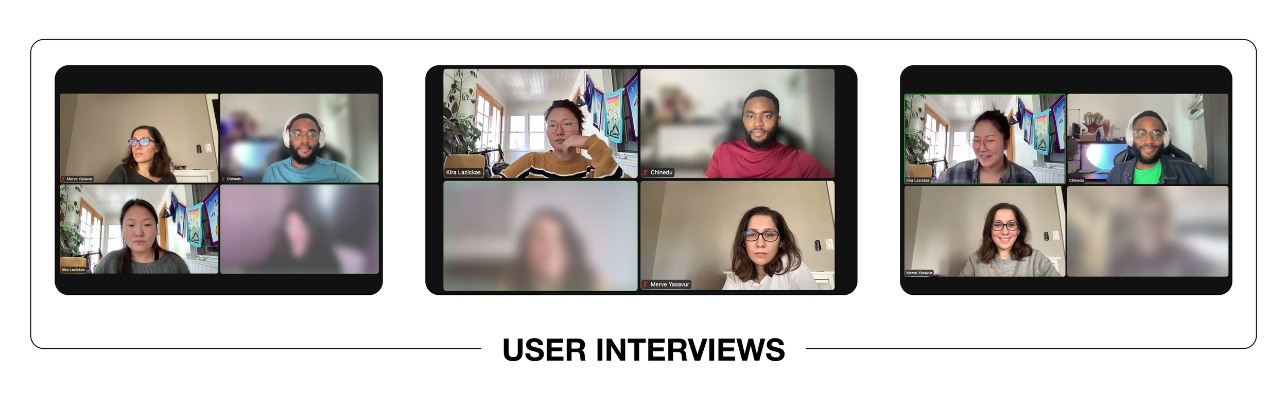
USER INTERVIEWS
We conducted interviews with six parents from various backgrounds, including queer parents, fathers, and mothers. This approach allowed us to gather valuable insights and perspectives, ensuring that our design would cater to a wide range of user experiences and preferences.
Interview Focus Areas
Childcare Practices and Experiences: Uncovered the critical role childcare plays in parents' lives and their past experiences with different platforms.
Desired Skills and Services: Identified what parents look for in caregivers, reasons for changing providers, and necessary information for making informed decisions.
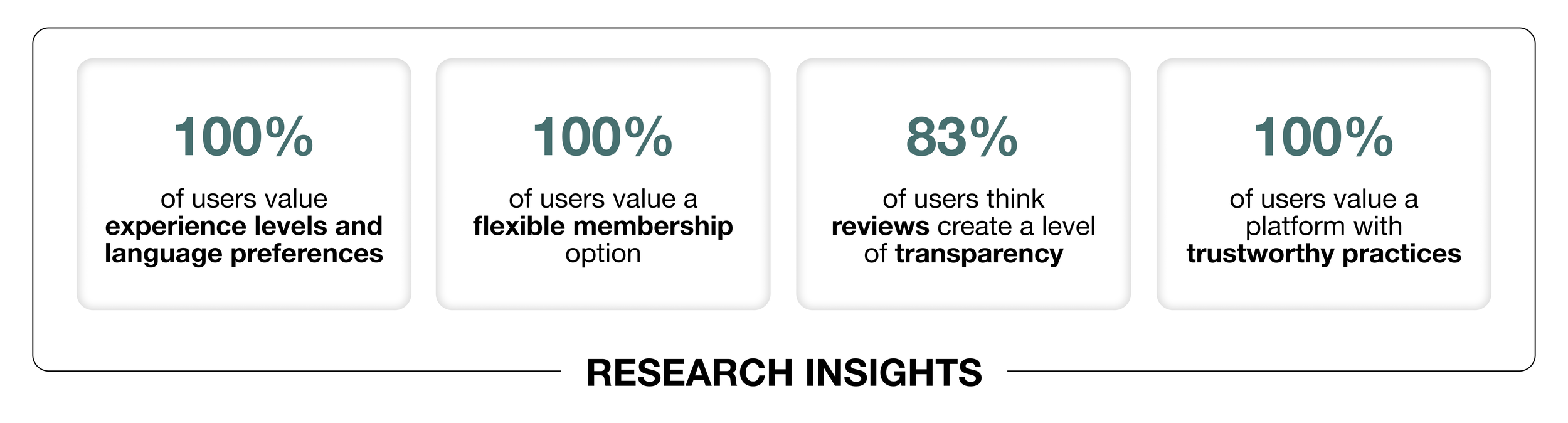
Collaborative Insights: Mapping the Path Forward
RESEARCH INSIGHTS
Working closely with the lead researcher, I helped create an affinity map from our interview data. Our team then collectively reviewed the emerging trends to pinpoint key focus areas. Together, we crafted a comprehensive research plan, incorporating our individual insights. During the interview sessions, I took on the role of notetaker, ensuring that every detail was captured for our analysis.
Brainstorming session with the team provided us with possible How Might We’s
The "matching phase" was a key focus of this sprint. We aimed to enhance the onboarding experience by categorizing the onboarding quiz into clear sections. Additionally, the team implemented an "onboarding tour" to familiarize users with the business before they commit, ensuring a smoother and more informed onboarding process.

DEFINE
The scope of the project was to focus on the primary parent’s journey
PERSONA + HMW
Keeping inclusivity and diversity in mind, we found mostly unanimous trends from our research data. I worked alongside my team in finalizing the needs and goals of our persona, making sure it’s constantly aligned with the business and users’ needs.

“Monica is a working mother who is frustrated when trying to find a caregiver who can best match with both her and her daughter’s criteria. She needs to find an ethical and transparent platform along with a caregiver who is experienced in childcare, prioritizes safety and is reliable.”
DEVELOP
Crafting the Primary Parent Journey
USER FLOW
With our key objectives and trends in mind, we collaboratively created a user flow. This user flow aimed to design an effective journey for primary parents, guiding them through the process of being matched with a caregiver and introducing them to the membership options.

Condensed user flow for readability purpose. View full user flow
Following the creation of the user flow, our design studio focused on three main steps:
SKETCHES
We conducted series of design studios, iterating on our ideas after each client meeting. One of our main challenges was ensuring a cohesive user journey that minimizes bounce rates.
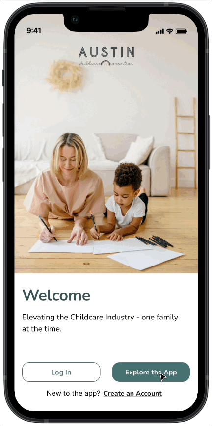
Onboarding: Introducing what the app and platform provides.
Children's Info & Caregiver Preferences: As parents create an account, they input their preferences to find the best caregiver match.
Membership: Providing different membership options with clear explanations. Parents choose a membership to access the app's services.

Few sketches from the team’s design studio. View full sketches
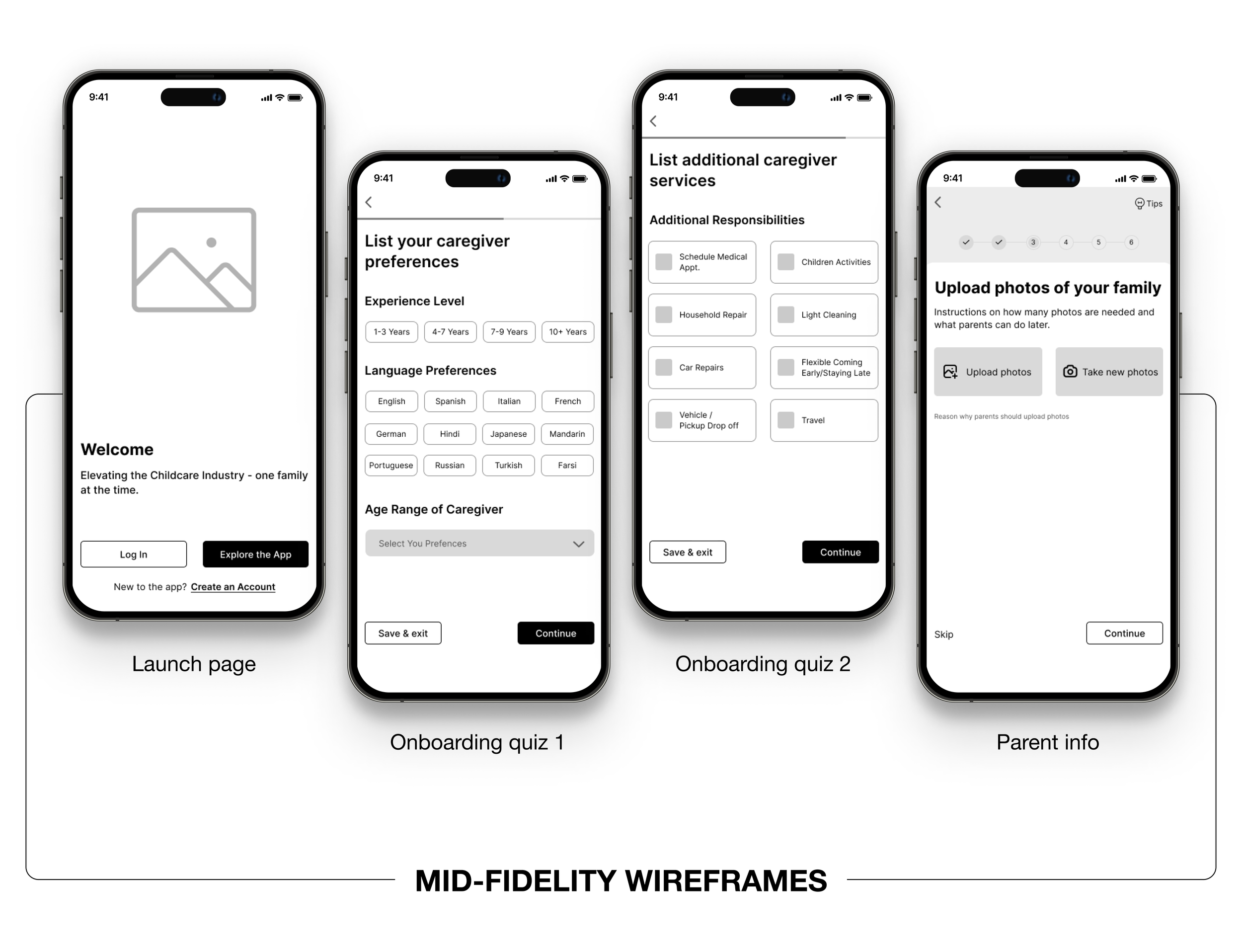
Crafting an Intuitive User Journey
WIREFRAMES + USABILITY TESTING
As the design lead, I prioritized creating an easy-to-navigate app, especially during the onboarding tour and quiz sections. I divided sketching tasks among the team, and we collaboratively developed mid-fidelity wireframes to visualize and refine our ideas, ensuring a seamless and user-friendly onboarding experience.
Early Stage Testing: Ensuring a User-Centered Design
Testing our mid-fidelity wireframe early was essential for both our team and the client. We aimed to understand the following:
Feature Familiarity: Ensure users can easily understand and navigate the app's features.
Caregiver Matching: Make finding a caregiver straightforward and stress-free.
Membership Upgrades: Simplify the process of upgrading memberships for additional features.
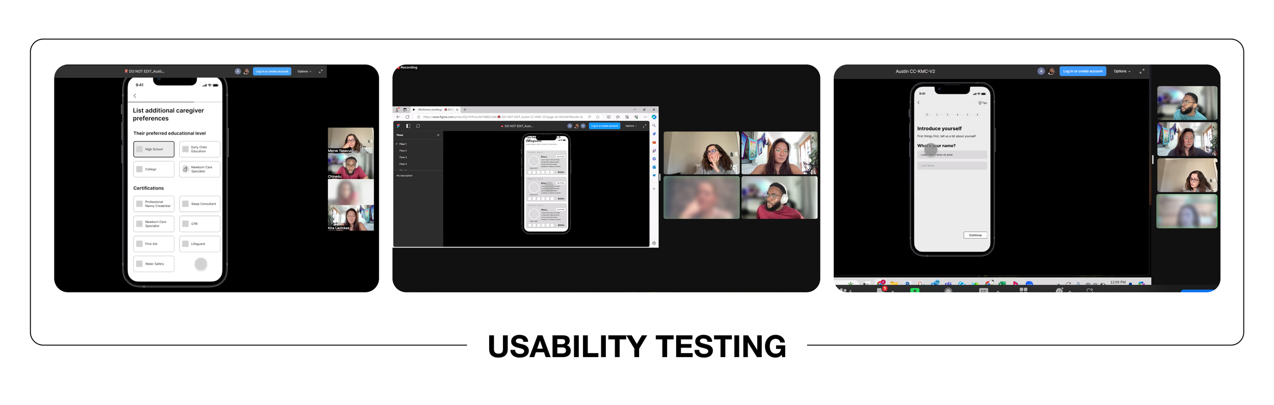
We did a usability test with 3 users who had participated in our earlier user interviews
Task: Users were instructed to explore the platform and create a job listing for hiring a caregiver, selecting their preferred criteria. Once a list of caregivers was generated, they were asked to walk through their next steps and actions.
Goal: To evaluate user platform usability to get matched with caregivers based on selected criteria and to understand the user's next steps when presented with a list of caregivers.
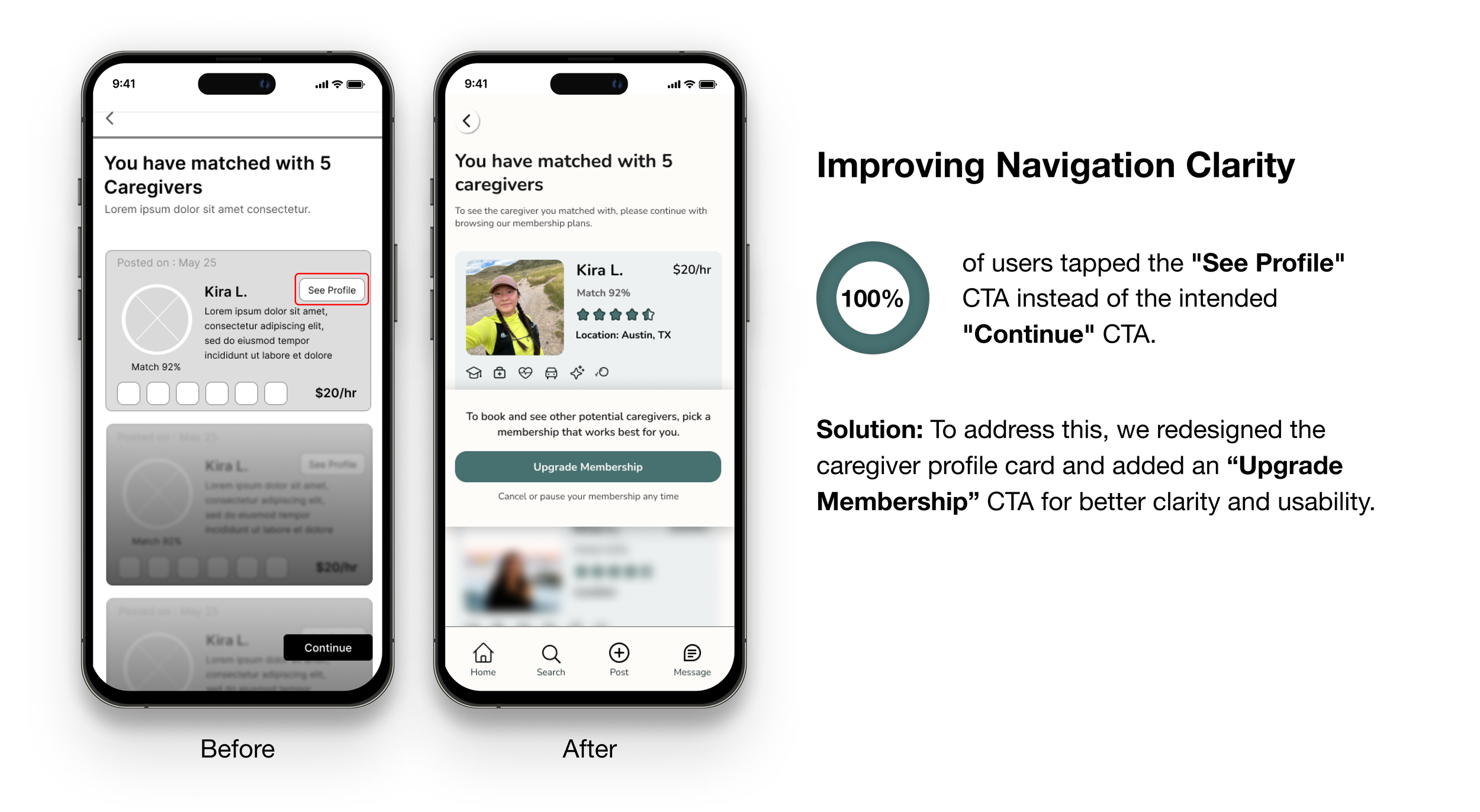
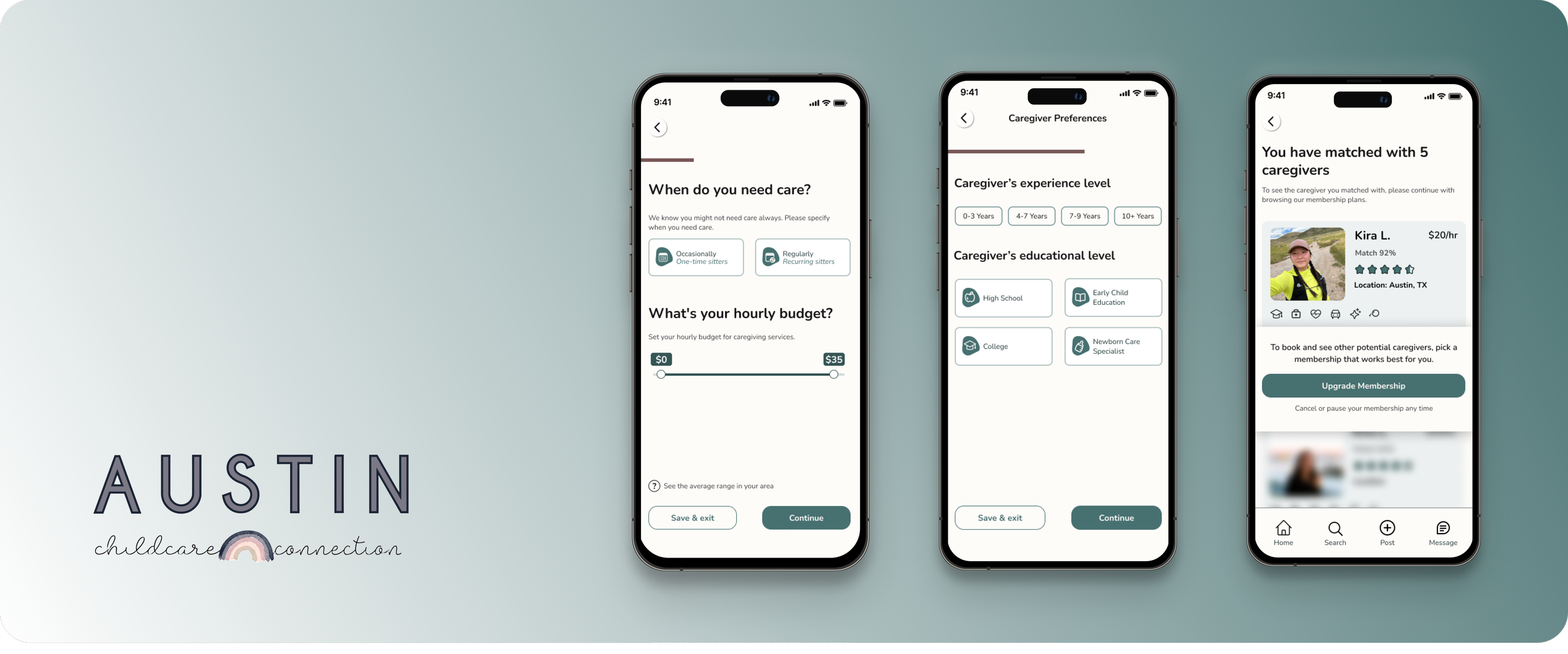
Matched caregivers based on users’ selections

Upgrade membership overlay page

Caregiver preference page
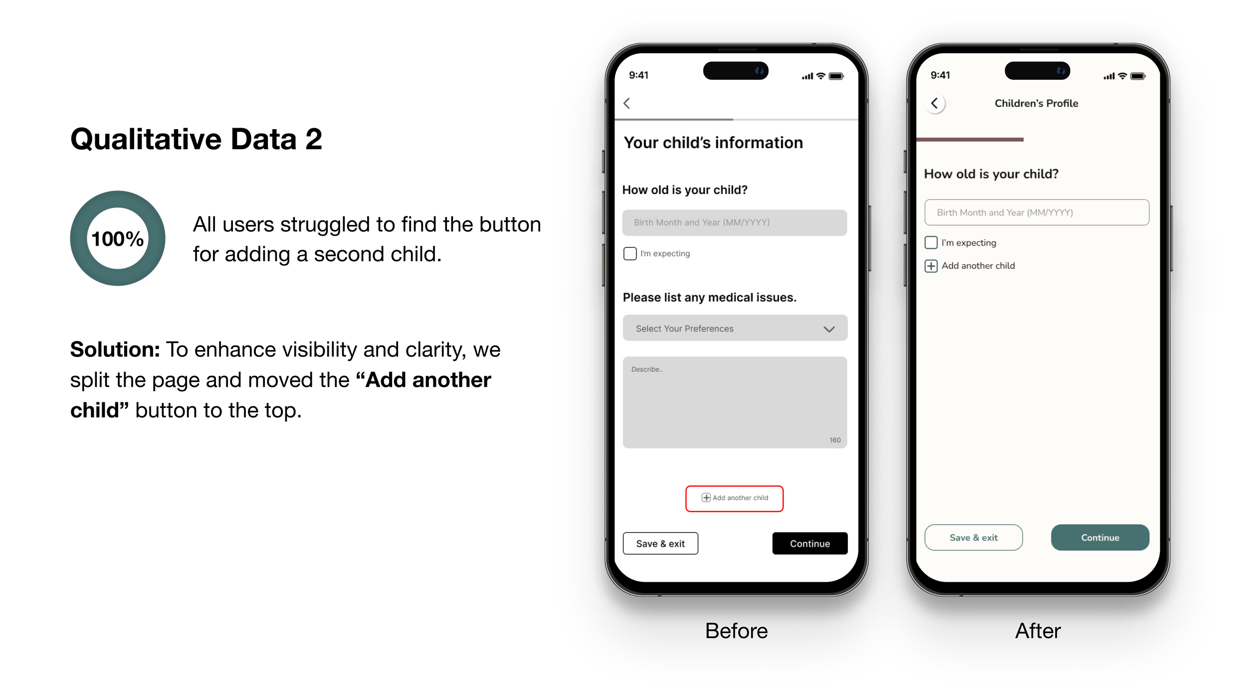
Children’s profile page
A/B TESTING
Imagery Decision
To decide between using real photos or illustrations for the onboarding tour, we conducted A/B tests with 10 users. We asked them to associate words like engaging, off-putting, comforting, generic, distracting, and inauthentic with each image type.
Findings
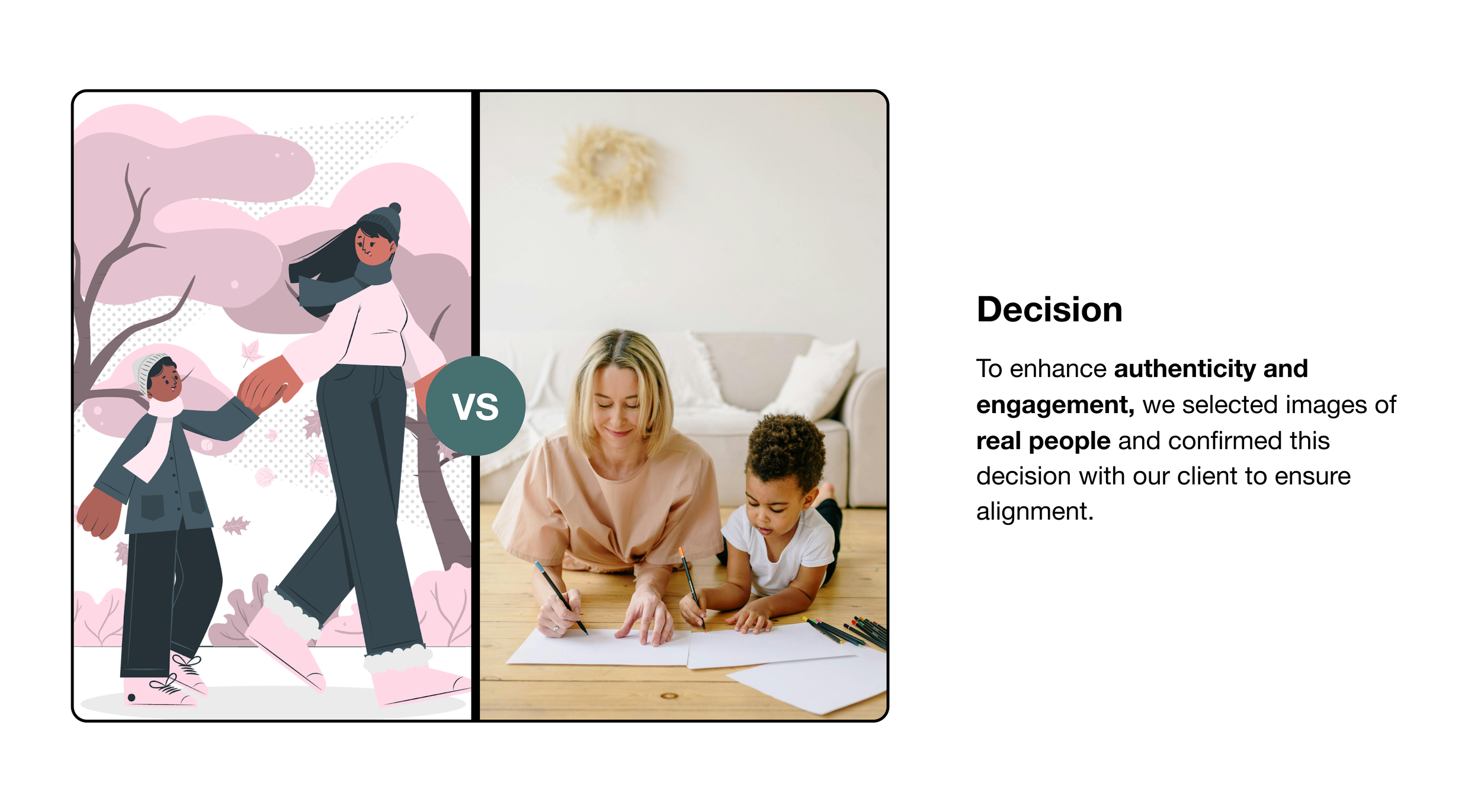
Real photos were preferred for being "engaging" and "friendly," while illustrations were viewed as "generic" and "inauthentic."
Illustration and real photo used for the A/B testing
Designing a Welcoming and Trustworthy Experience
STYLE GUIDE
Our goal was to create a color scheme that was welcoming, safe, accessible, and aligned with the brand’s guidelines. I led the design of the style guide for this project.
We chose:
Secondary Color: Emerald green for the main CTA button.
Primary/Tertiary Colors: For the slide indicator and to highlight features.
For typography, we selected a rounded typeface to ensure a welcoming, readable, and modern experience. Our icons, sourced from the Iconify plugin on Figma, followed the same rounded aesthetic.
This design approach aimed to reflect Austin Childcare Connection’s values and provide a trustworthy user experience.

Some style guide used for the visual design. View full style guide
Design Collaboration and Leadership
HIGH FIDELITY DESIGNS
As the design lead, I ensured the team worked seamlessly on sketches, mid-fidelity wireframes, and high-fidelity designs using Figma. I maintained adherence to the style guide I created and facilitated collective screen reviews. I coordinated with the project manager to schedule regular client meetings for progress reviews and feedback.
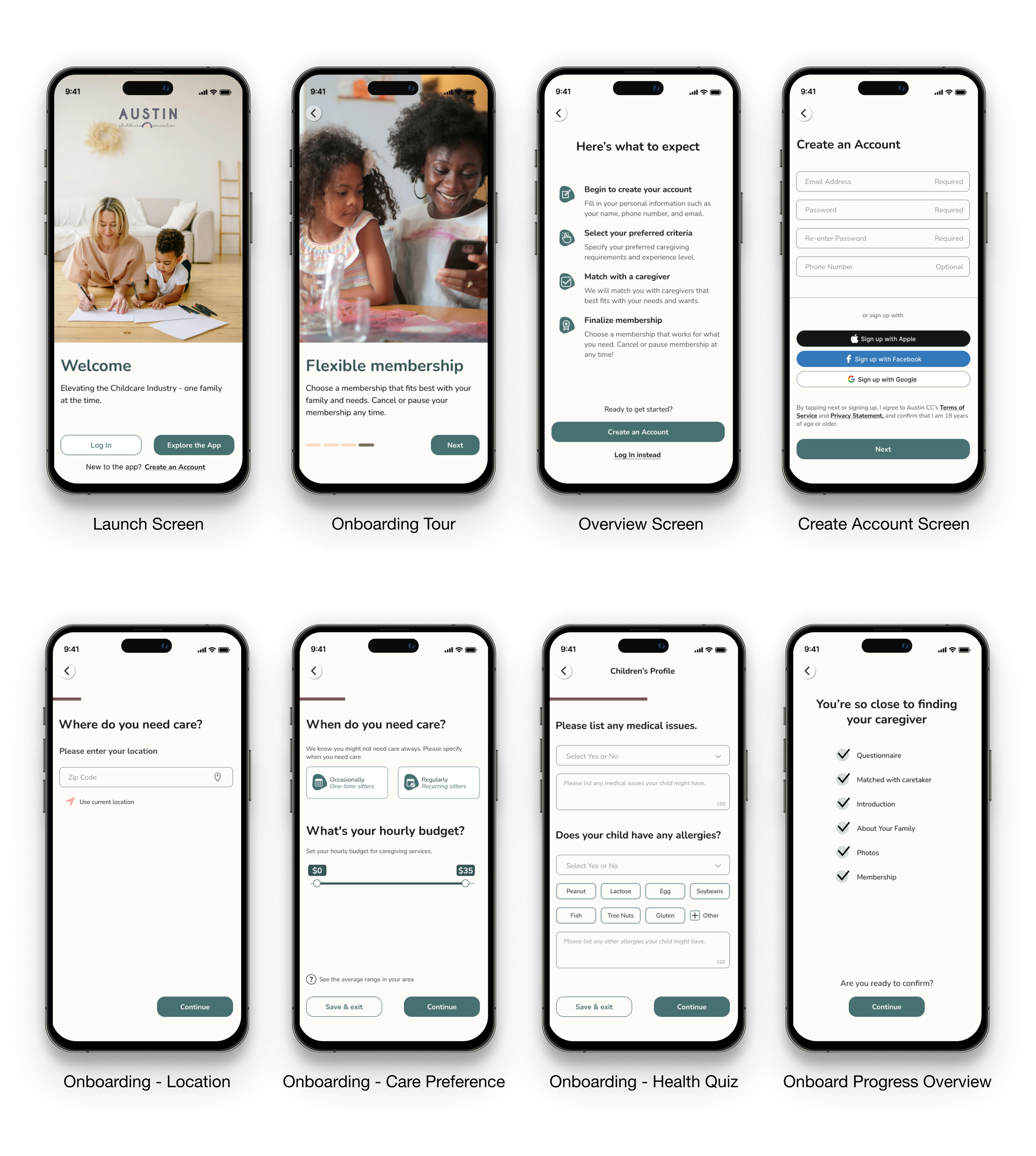
Some HI-Fi mockups of final visual design. View full user flow
REFLECTION
Next Steps
This project inspired us to think creatively and push our design further. Given the scope and time constraints, our next steps include:
Individual Child Profiles: Allow parents to share specific profiles with caregivers.
Background Checks: Enable both caregivers and parents to undergo background checks for safety.
User Homepage: Provide access to profiles, job postings, and educational material.
Hi-Fidelity Design Iteration: Ensure the design aligns with the iOS design system.
Learnings
Importance of Early Testing: Early-stage usability tests were crucial in identifying pain points and refining the design.
Flexibility in Design: Being adaptable and open to changes based on user feedback significantly improved the final product.
Continuous Communication: Regular communication with the client and within the team was key to addressing issues promptly and maintaining project momentum.
Thank you for sticking with us till the end! 😊
Need a hand with a project or want to grab a cup of coffee?
Reach out at neduayinotu@gmail.com
MORE PROJECTS
Champion Party
Website Redesign: Escaping the Clown Circus for Vintage Charm
REI Ready
A Companion App Enhancing Outdoor Adventures