Transforming a Growing Childcare Platform
From Facebook Beginnings to a Seamless Mobile Experience
Role: Design Lead Timeline: 3 weeks Team: 3 UX Designers
Summary: A seamless mobile app experience that significantly improved the onboarding process and enhanced caregiver matching capabilities.
Austin Childcare Connection (ACC) connects parents and nannies, fostering learning, questions, and insights within the childcare industry. Originally designed for a small Facebook group of mothers, the platform faced challenges as the business grew. The website had a high bounce rate and low task completion rates, frustrating users—primarily parents—who found it cumbersome and unintuitive.
The goal was to redesign the platform into a user-friendly iOS mobile application that enabled parents to effortlessly find and match with caregivers, ensuring a seamless journey that reflected the values of trust, transparency, and education.
Understanding the Needs of Busy Parents
To ensure Austin Childcare Connection’s successful transition from a desktop website to an iOS app, we conducted a thorough business analysis, task analysis, and user interviews. The primary goal was to understand the current business needs and how to make childcare services more accessible on the go.
User Interviews: We interviewed six diverse parents—including queer parents, fathers, and mothers—to gain insights into their childcare practices and what they value in caregivers. While the business provided one participant, our team sourced additional candidates through referrals. We validated these participants by screening for those who were primary parents, had sought childcare services before, and currently had a child in their care. Scheduling interviews was made seamless with Google Appointment Scheduler, allowing participants to select convenient time slots.
Listening to the Voices That Matter
Just want to explore the final design? Click here to view hi-fi prototype
Clearly articulate the business's offerings, establish trust and transparency, and provide a seamless onboarding experience for users throughout the account creation and job posting process.
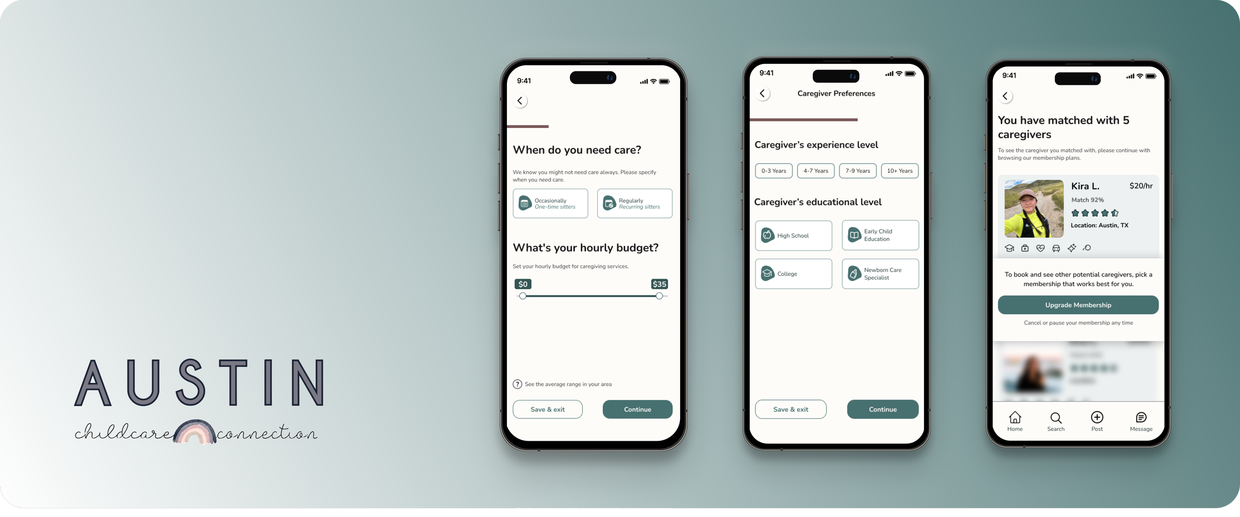
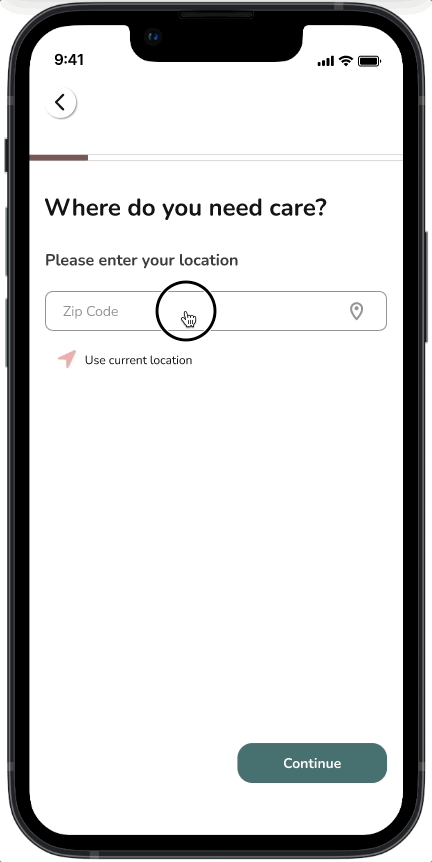
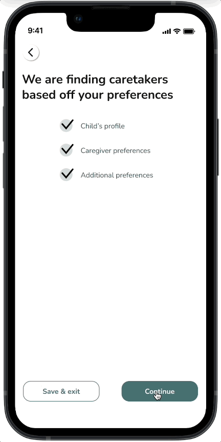
1. Easy Onboarding Tour
Empowering parents to effortlessly match caregivers to their children's specific needs through a flexible criteria system, while also providing the convenience of saving progress during the process.
2. Onboarding Questions
Fostering trust and informed decision-making, the platform will provide primary parents with comprehensive caregiver profiles including qualification summaries, clear membership benefits, and authentic user reviews.
3. Transparent Matching
We conducted interviews with six parents from various backgrounds, including queer parents, fathers, and mothers. These interviews provided valuable insights into childcare practices, desired skills and services in caregivers, and the critical role childcare played in their lives. Synthesizing our research findings, we identified key insights that guided our design process for the primary parent journey.
RESEARCH
1. BALANCING ONBOARDING
We found that simplicity in onboarding was crucial; too much complexity could overwhelm users.
2. PERSONALIZATION
While customization was important, it was crucial to keep features simple to avoid complicating the user experience.
3. INTUITIVE MATCHING
Users preferred engaging matching that enhanced their experience without losing essential details.
Working closely with the lead researcher, I helped create an affinity map from our interview data. Our team then collectively reviewed the emerging trends to pinpoint key focus areas. Together, we crafted a comprehensive research plan, incorporating our individual insights. During the interview sessions, I took on the role of notetaker, ensuring that every detail was captured for our analysis.
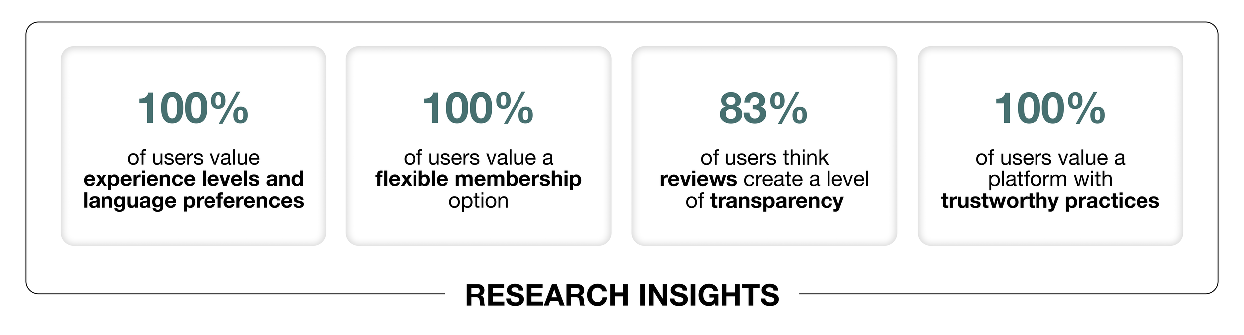
RESEARCH INSIGHTS
The "matching phase" was a key focus of this sprint. We aimed to enhance the onboarding experience by categorizing the onboarding quiz into clear sections. Additionally, the team implemented an "onboarding tour" to familiarize users with the business before they commit, ensuring a smoother and more informed onboarding process.
CHALLENGES

Our design phase began with creating sketches and mid-fidelity wireframes that focused on key sections: onboarding, children's information, caregiver preferences, and membership options. As the design lead, I prioritized creating an easy-to-navigate app, particularly during the onboarding tour and quiz sections. I organized a design studio with the team to brainstorm sketches and collaboratively developed wireframes to visualize and refine our ideas.
DESIGN METHODS & OUTCOMES

Few sketches from the team’s design studio. View full sketches
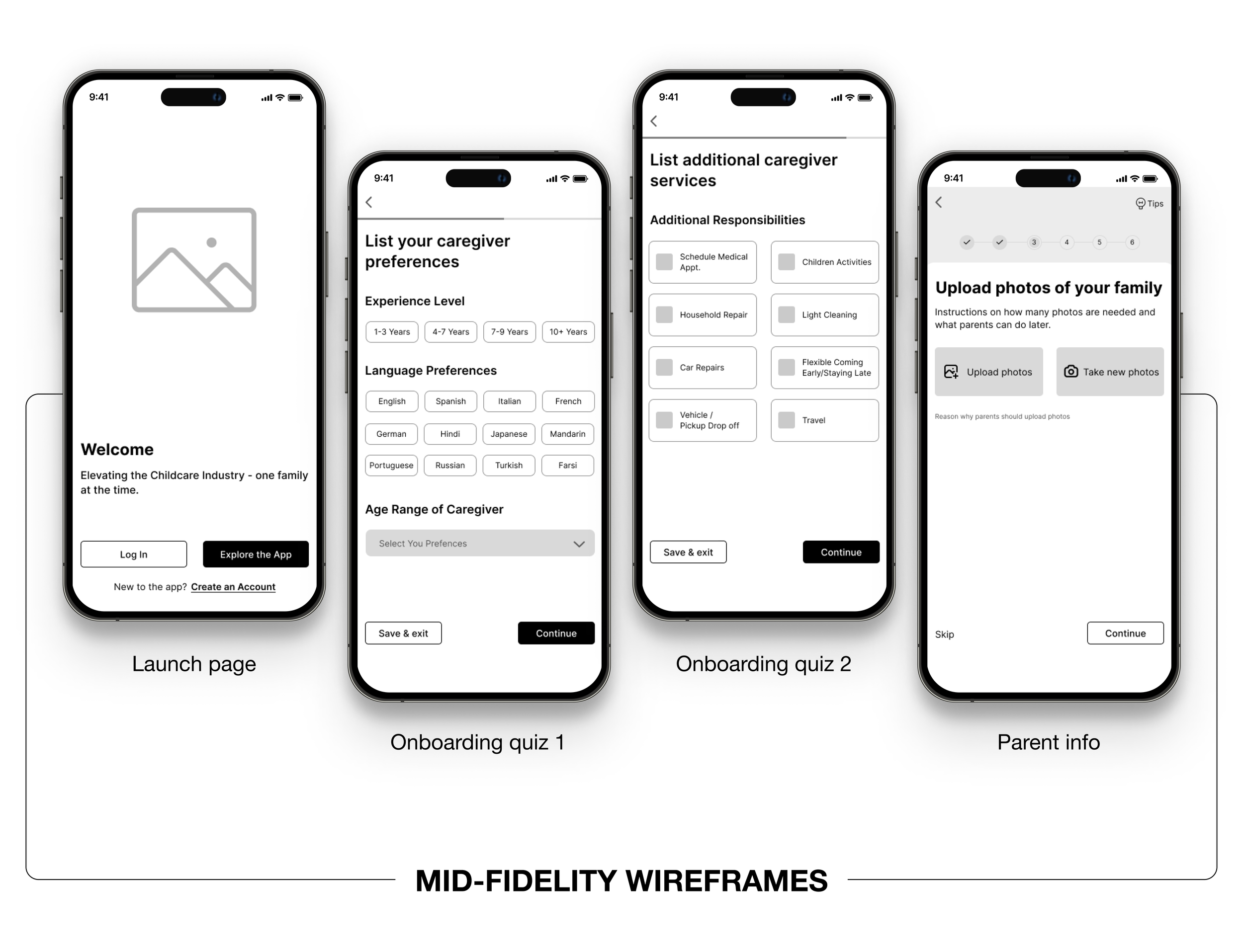
Few screens of the wireframe. View full wireframe
USABILITY TESTING & ITERATIONS
To validate our design, we conducted usability testing with three users who had participated in our earlier user interviews. We aimed to understand their interactions with the platform, especially in terms of feature familiarity, caregiver matching, and membership upgrades. These tests provided crucial quantitative and qualitative feedback that helped us refine the design further.
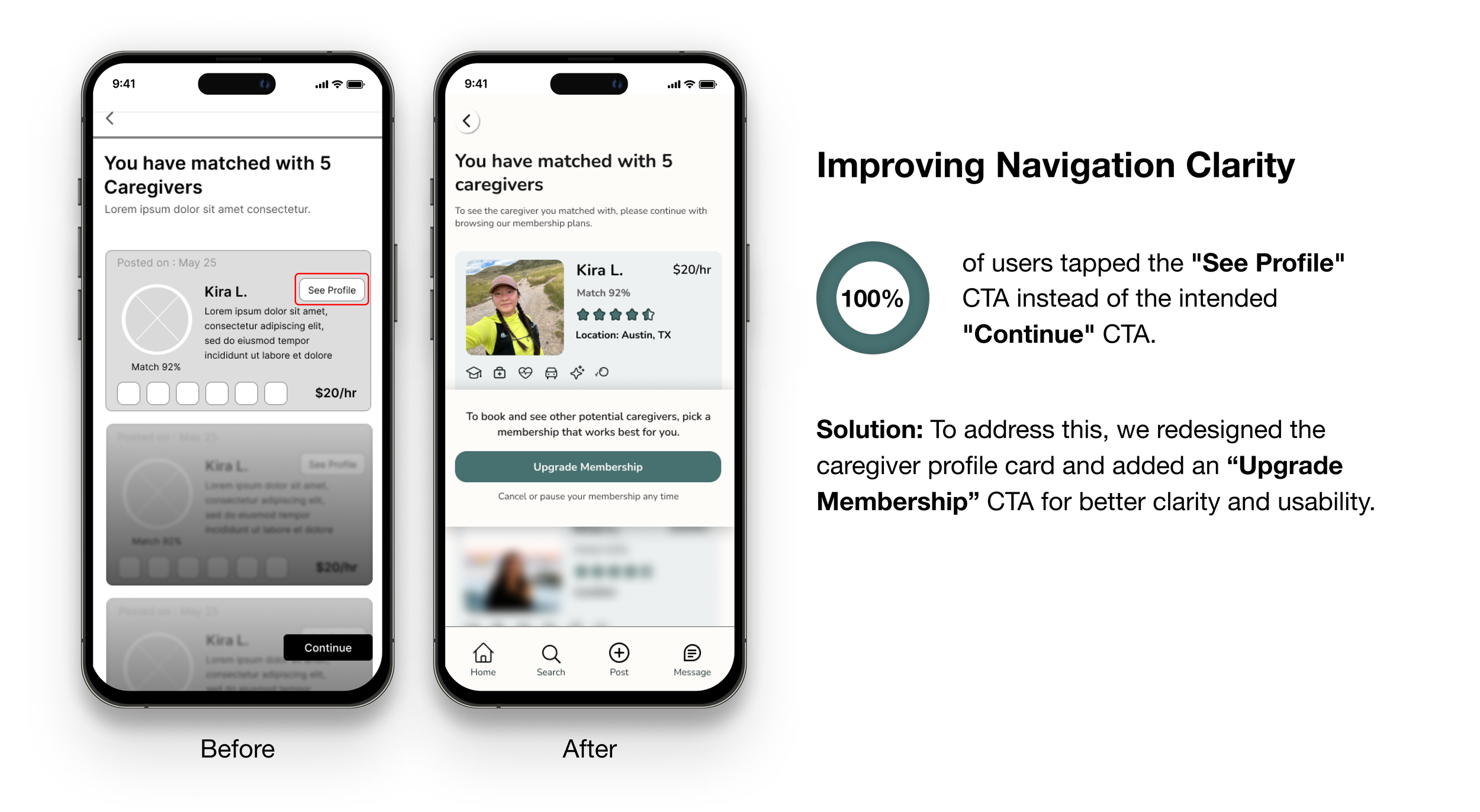
TEST INSIGHT & ITERATION 1

TEST INSIGHT & ITERATION 2

TEST INSIGHT & ITERATION 3
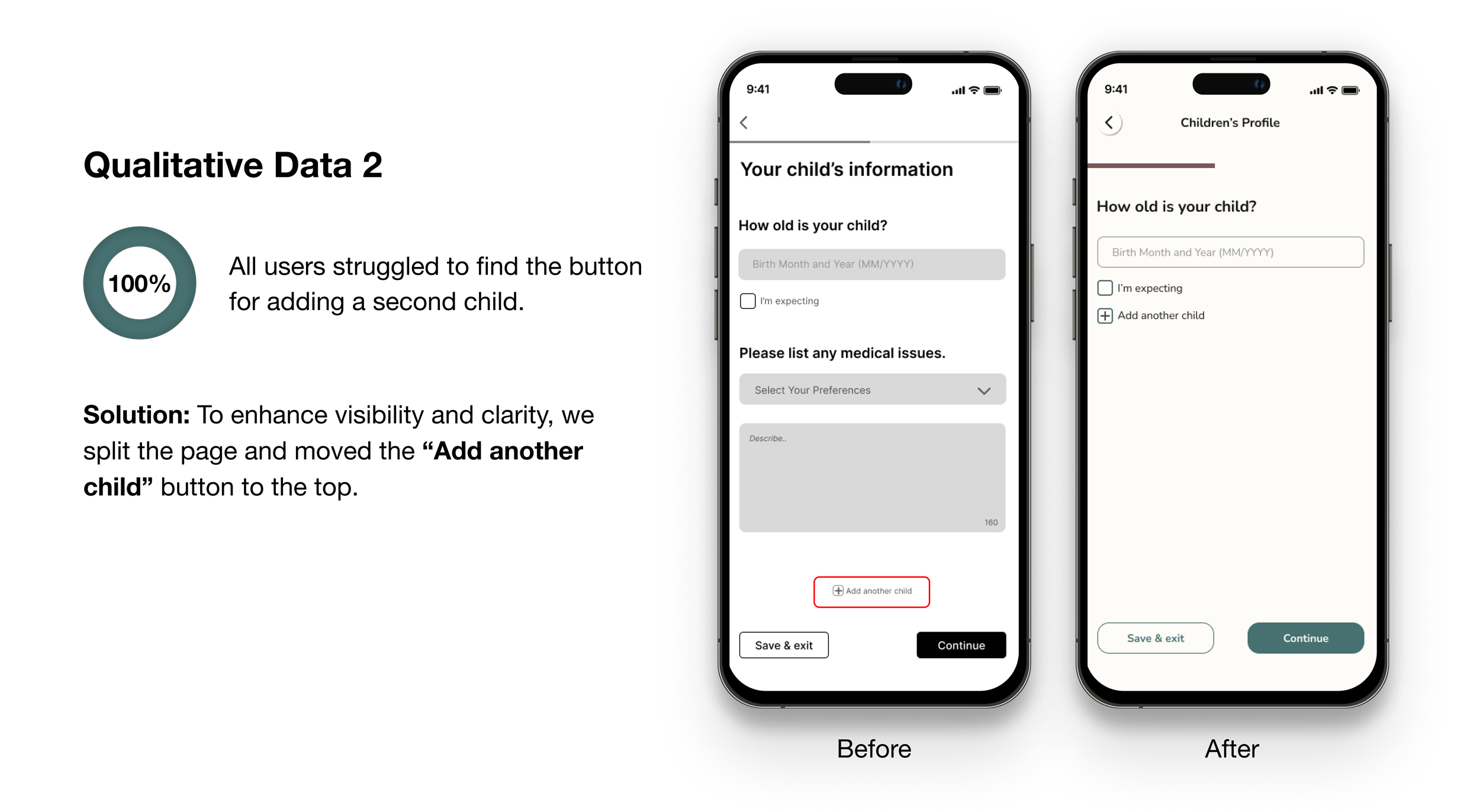
TEST INSIGHT & ITERATION 4
My goal was to create a color scheme that was welcoming, safe, accessible, and aligned with the brand’s guidelines. I led the design of the style guide for this project. For typography, we selected a rounded typeface to ensure a welcoming, readable, and modern experience. Our icons, sourced from the Iconify plugin on Figma, followed the same rounded aesthetic.
STYLE GUIDE

Some style guide used for the visual design. View full style guide
We also conducted A/B testing with ten users to decide between using real photos or illustrations for the onboarding tour. Real photos were preferred for being "engaging" and "friendly," while illustrations were viewed as "generic" and "inauthentic." Based on this feedback, we chose real photos to create a more engaging and trustworthy user experience.
A/B TESTING
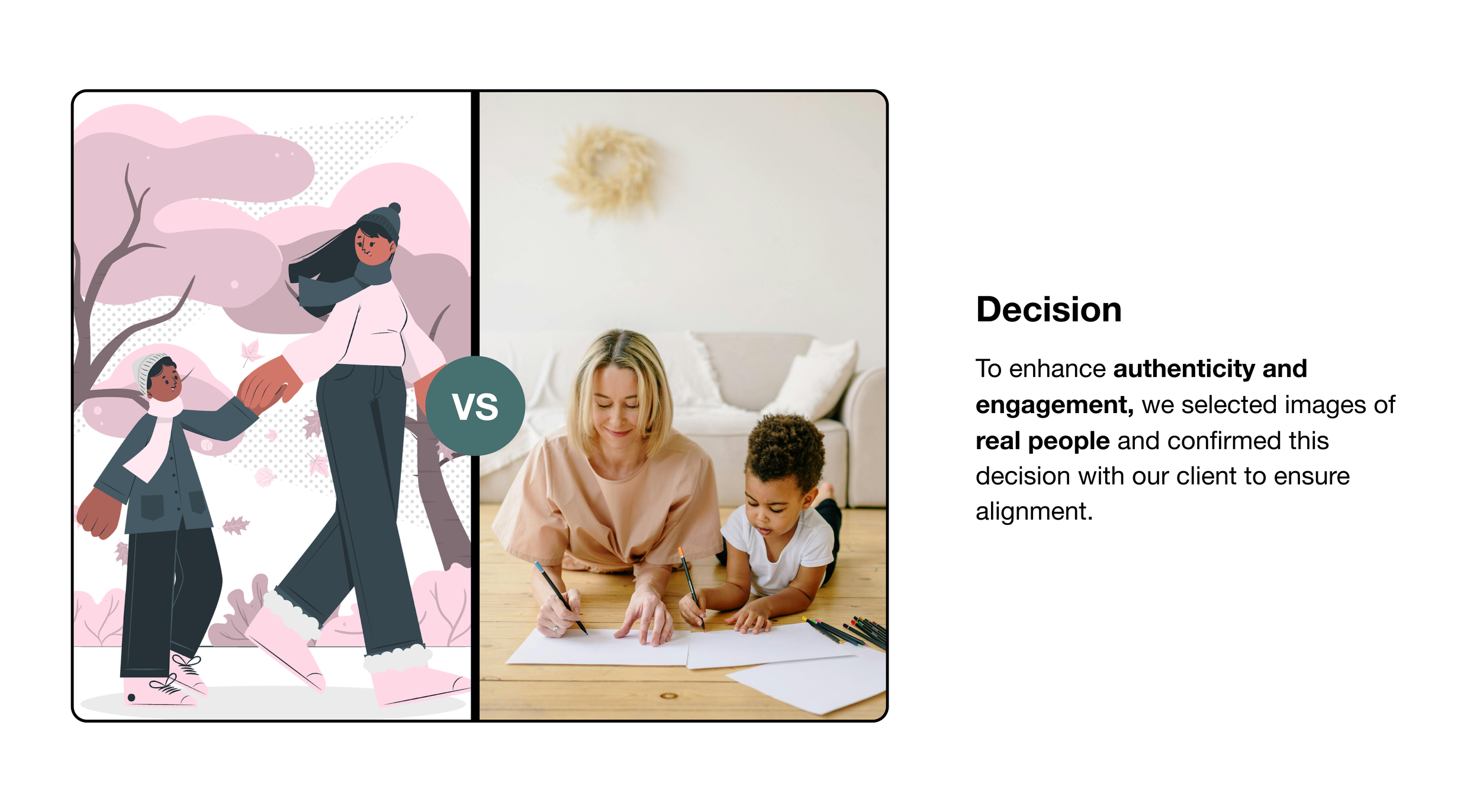
Illustration and real photo used for the A/B testing
After iterations from the usability test, the final high fidelity design successfully enhanced the user experience and built trust with users. By balancing thoroughness and convenience in the onboarding process, we improved user engagement. The design created a welcoming and inclusive experience for diverse family structures, enabling parents to make informed childcare decisions with ease. The successful implementation of features such as personalized caregiver matching and clear membership options further contributed to a positive user experience.
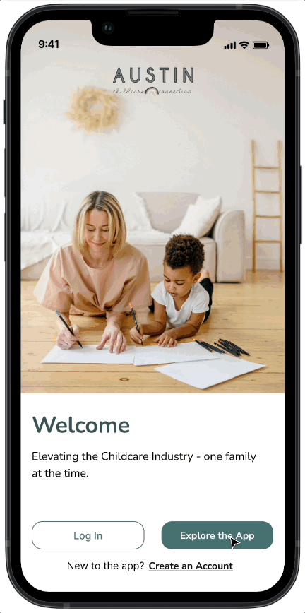
HIGH FIDELITY DESIGNS
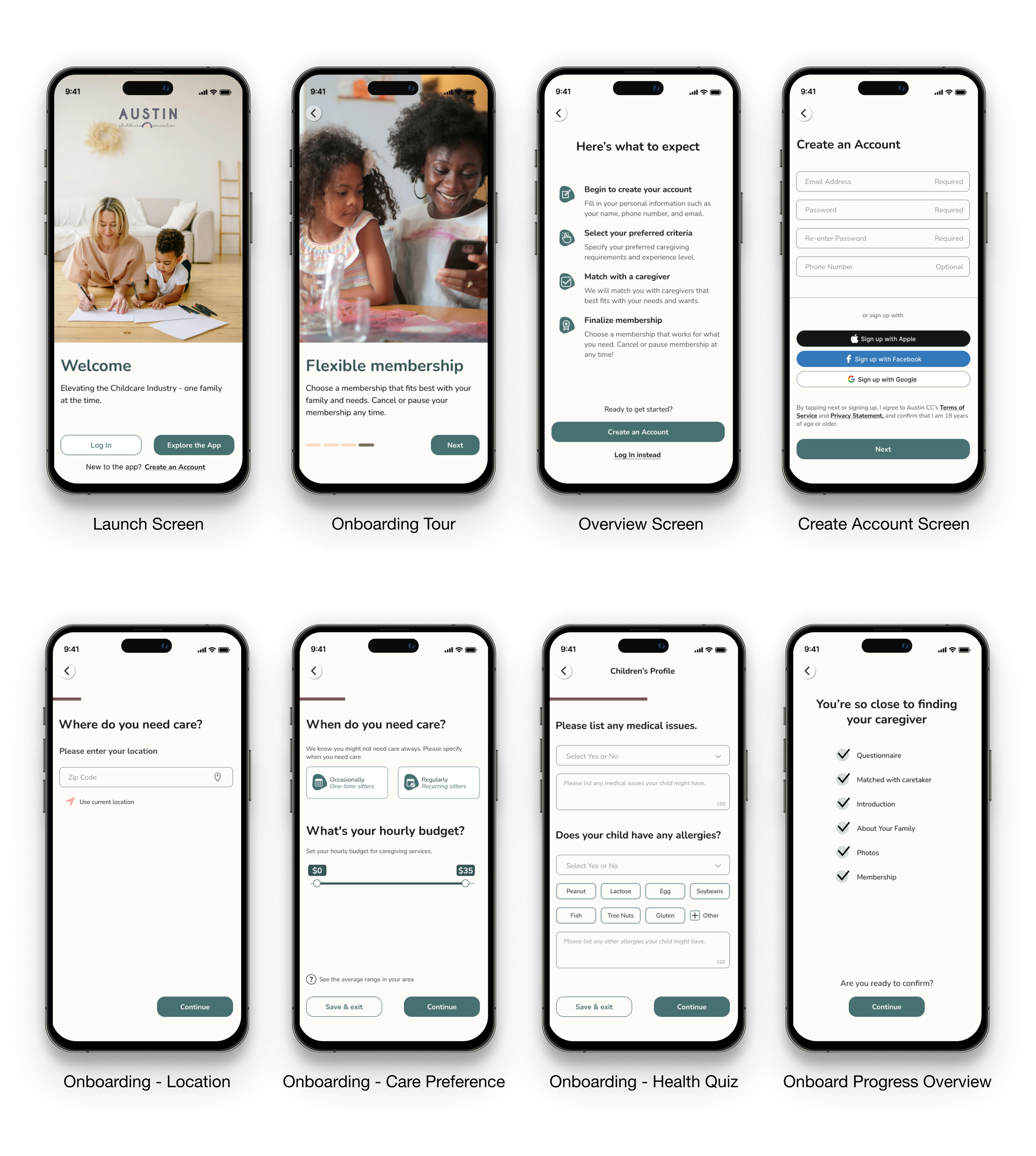
Some HI-Fi mockups of final visual design. View full user flow
NEXT STEPS
This project inspired me to think creatively and push my designs further. Our client was pleased with the final prototype and will pass the file across to a developer. Given the scope and time constraints, our next steps if we work on another sprint will be research and design for the following;
Individual Child Profiles: Allow parents to share specific profiles with caregivers.
Background Checks: Enable both caregivers and parents to undergo background checks for safety.
User Homepage: Provide access to profiles, job postings, and educational material.
Hi-Fidelity Design Iteration: Ensure the design aligns with the iOS design system.
Importance of Early Testing: Early-stage usability tests were crucial in identifying pain points and refining the design.
Flexibility in Design: Being adaptable and open to changes based on user feedback significantly improved the final product.
Continuous Communication: Regular communication with the client and within the team was key to addressing issues promptly and maintaining project momentum.
TAKEAWAYS
Thank you for sticking with us till the end! 😊
Need a hand with a project or want to grab a cup of coffee?
Reach out at neduayinotu@gmail.com
MORE PROJECTS
Champion Party
Website Redesign: Escaping the Clown Circus for Vintage Charm
REI Ready
A Companion App Enhancing Outdoor Adventures